As a building block for a brand, collateral helps to set the stage, tone and voice. Each piece lends a little more depth to the overall story. Below are a few of the actors and a quick description of their role.
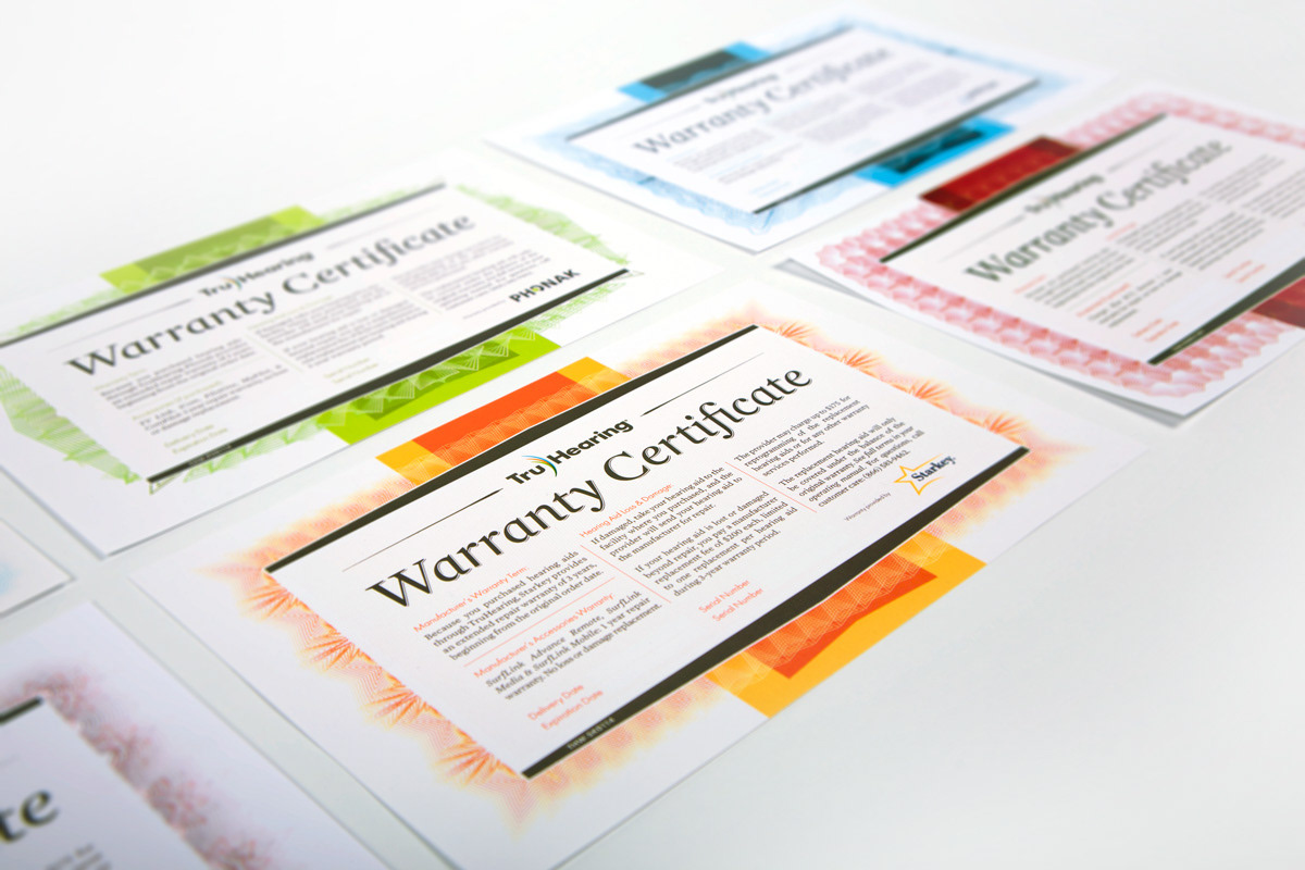
Warranty certificates: These go out with the supply of batteries that accompany each hearing aid purchase. Each manufacturer has it's own unique pattern, based on attributes of their logo. The wide color bands were not only an opportunity for a strong pop of vivid color, but also marked where the certificate folds, for an easy fit inside the hearing aid battery package.
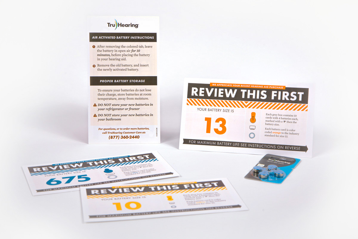
Battery Info Card: With the supply of batteries and the warranty, also included in the package is a simple card that contained helpful information about battery care, and a strong confirmation that the customer received the right size batteries for their hearing aid. The new batteries are mercury free and are air activated, which are different from older mercury-based batteries. While much safer, many repeat wearers needed instructions on how to care for their new batteries.
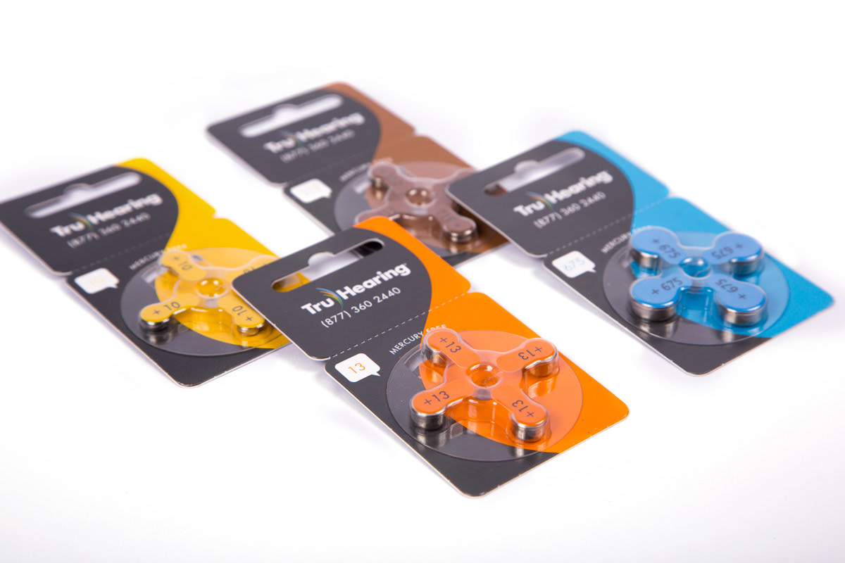
Battery card design. Each box contained 10 battery cards each.
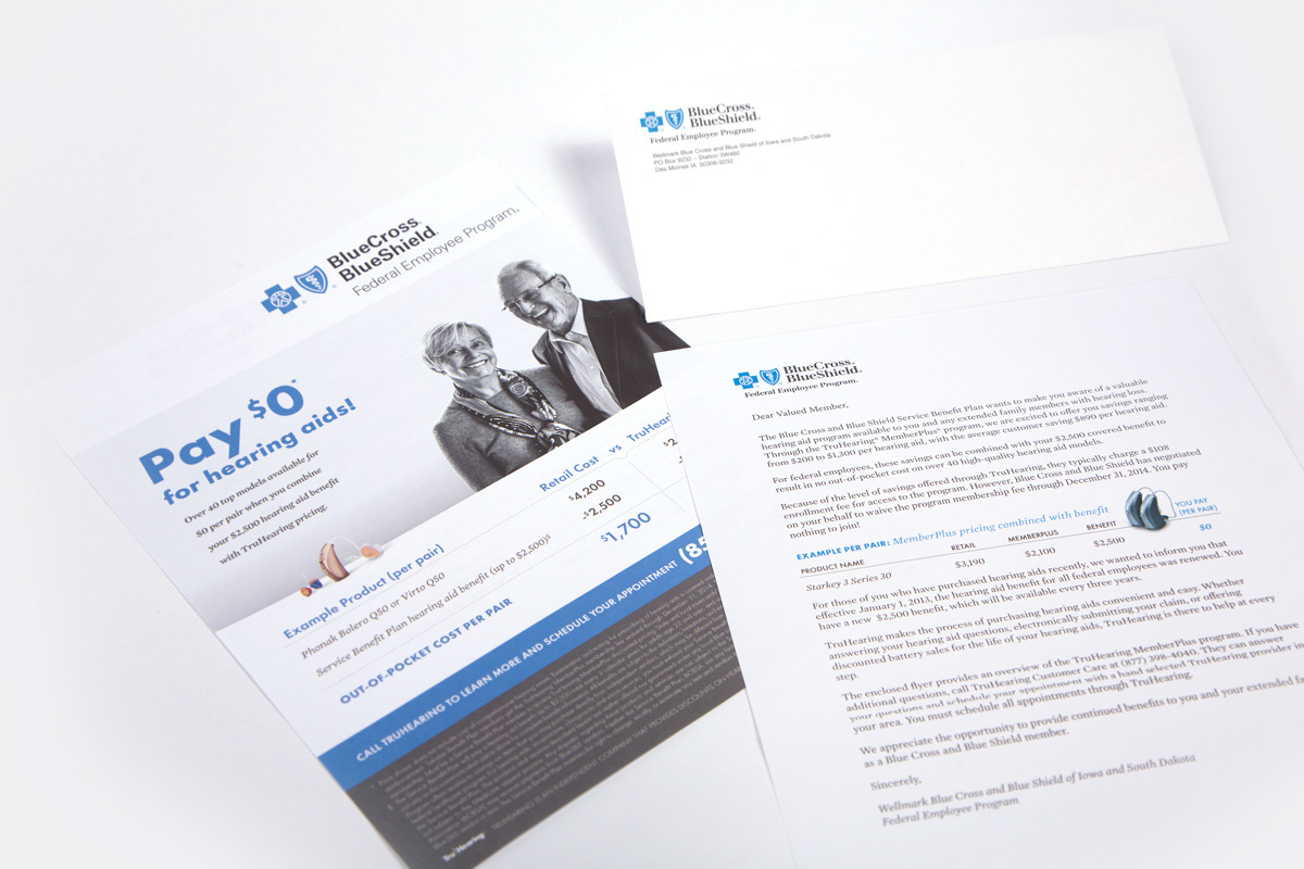
We also created a variety of targeted collateral pieces on behalf of health plans; we provided design services, and collaborated to create informational mailers that health plans could send to their membership. Most elligible plan members didn't know that they had access to deep discounts on hearing aids just by being a member of their health plan. A simple introductory letter along with a customized flyer in a health plan envelope supported the call to action and savings message. Shay Spaulding and Annie Jensen contributed to the ongoing designs.
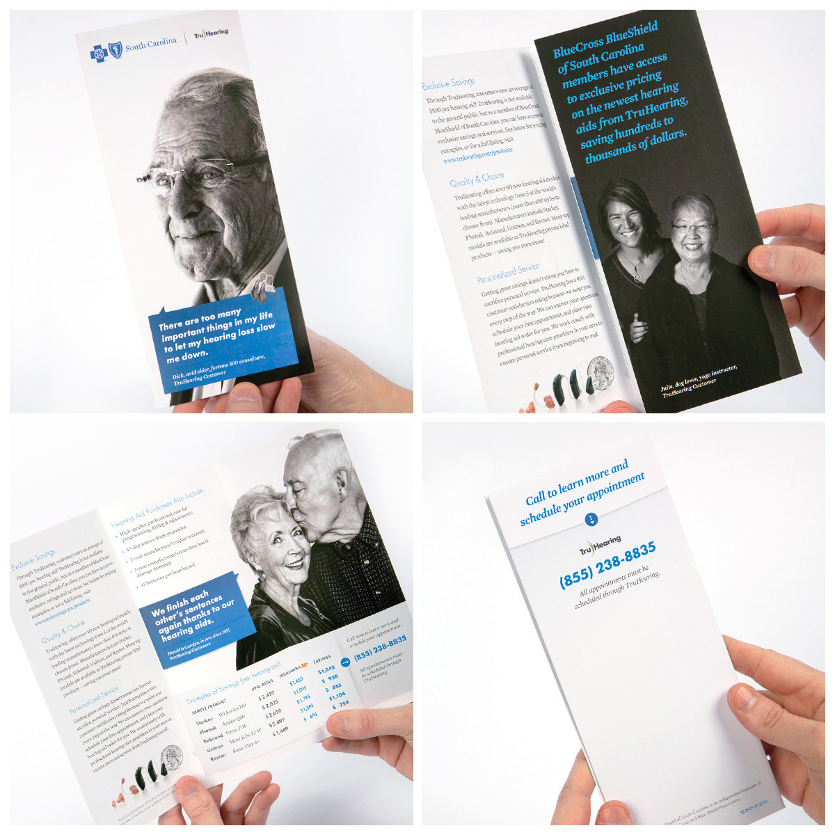
Taking the same approach as the mailer and cues from other flyers, we created a simple trifold. Printed on a very nice topkote 70# cover, with a smooth soft-touch finish. The soft-touch finish helped the black and white photography to gain a beautiful velvet texture.
Cover Photo (top L) and full fold-out photo (bottom L) by Betina LaPlante. Interior fold photo (top R) by Marc Reynolds. All were actual customers with testimonials on the website as well. Design by Annie Jensen, Creative and Art Direction by John Fitch and Shay Spaulding.


As a system of marks, the secondary program word mark coordinated with the main logo. In addition, the color shifted hues to follow the program signature color. The third green version was reserved for a third future program expansion.
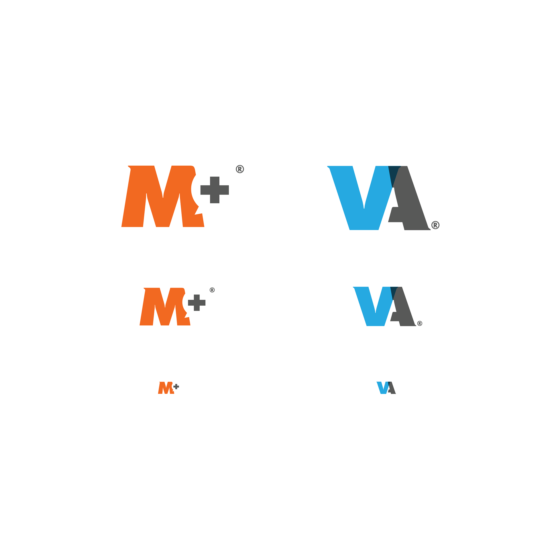
In addition to the wordmarks, a monogram was created for each of the programs offered. M+ picked up the vibrant orange key color, and the previous legacy program called ValueAdd used a clean, calm blue.