Franklin Covey helps organizations and individuals be more effective, and they have been at it a long time. However, as time changes, so do the needs of their users. Franklin Covey needed to have a way for users of their traditional paper product to transition to a new version of their digital counterpart.
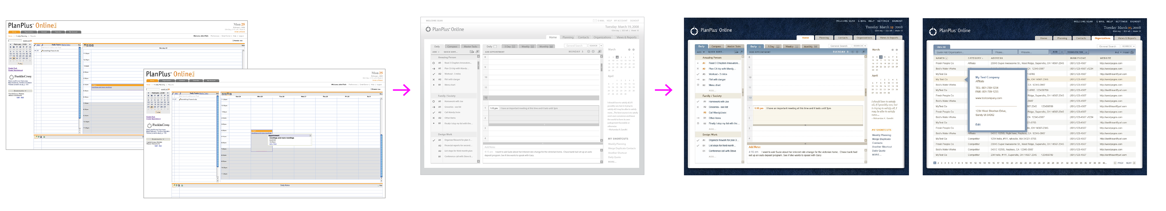
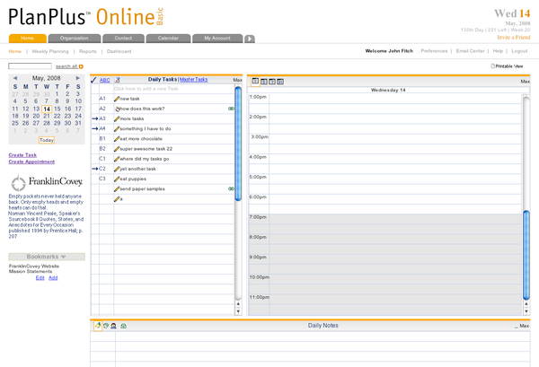
This is before we started work:
The initial request was to update the graphic look. As my team dug deeper and had more meetings, it became increasingly clear that graphical changes alone wouldn't help their long-term goals of customer satisfaction and retention. We offered to show them a different approach—one we felt would be more in harmony with their underlying concerns.
At this point, we did an extensive series of wireframes to illustrate how we felt we could best be of service. They needed a cohesive look at the web experience as a whole application. We wanted to show them a design solution that helped to move their business goals forward, while still updating the general look and feel.
When the extended team saw the work on the information architecture, user experience, and usability they caught the vision and quickly became strong collaborators. Their excitement fueled the next rounds of research and refinement.
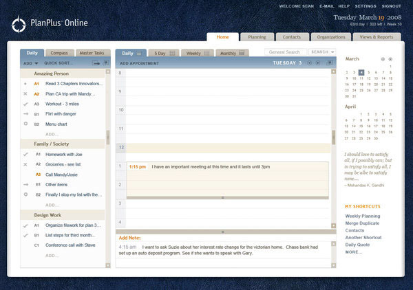
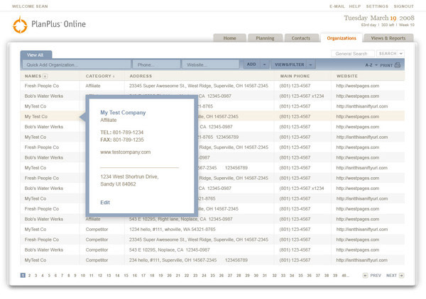
We sat in on several Franklin Covey executive training on personal planing and interviewed new and long-term customers. We then used detailed wireframes to map out interaction methods. We also used more detailed wireframes as shown above to refine placement and scale, illustrate user flow, and clarify information architecture. Based on the wireframes, the client was able to visualize and respond to the interface revisions and interactions, and rapidly refine the concepts.
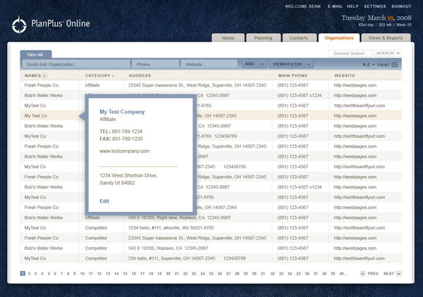
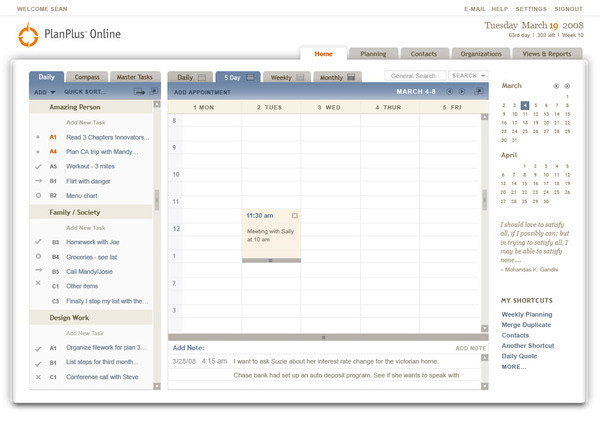
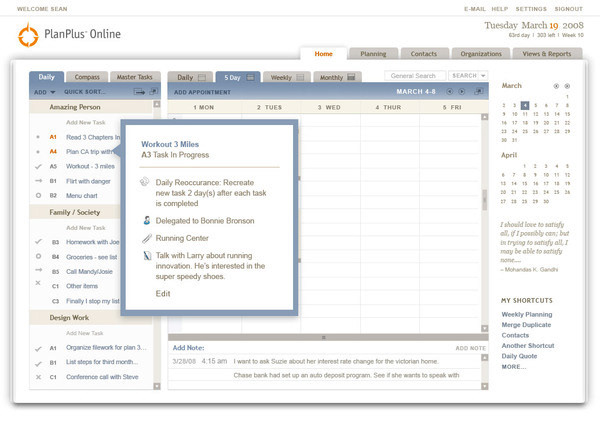
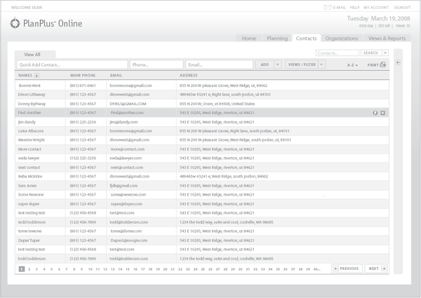
The final designs drew from the research and clarification process. We created an entirely new approach to productivity applications centered around the unique Franklin Covey planning methodology.