I have been asked for two things on this project: high resolution versions to look at (Frankly I don't have them), and second “If you could do the project today, what would you change?”
That is a lot easier question to hear/read than to answer. Mainly because soutions are born from collaboration between what the client and their business needs are and helping to expose the best things that may help their customers love their product. Understanding the clients technology constraints, budget, time, customer and context are part of that process. Without their participation, it is just speculation over an alternate reality.
Since the projects completion, there have been so many advances in UX and design practice (and amazing technology as well), that I can't help but take a quick outside view and make some general observations.
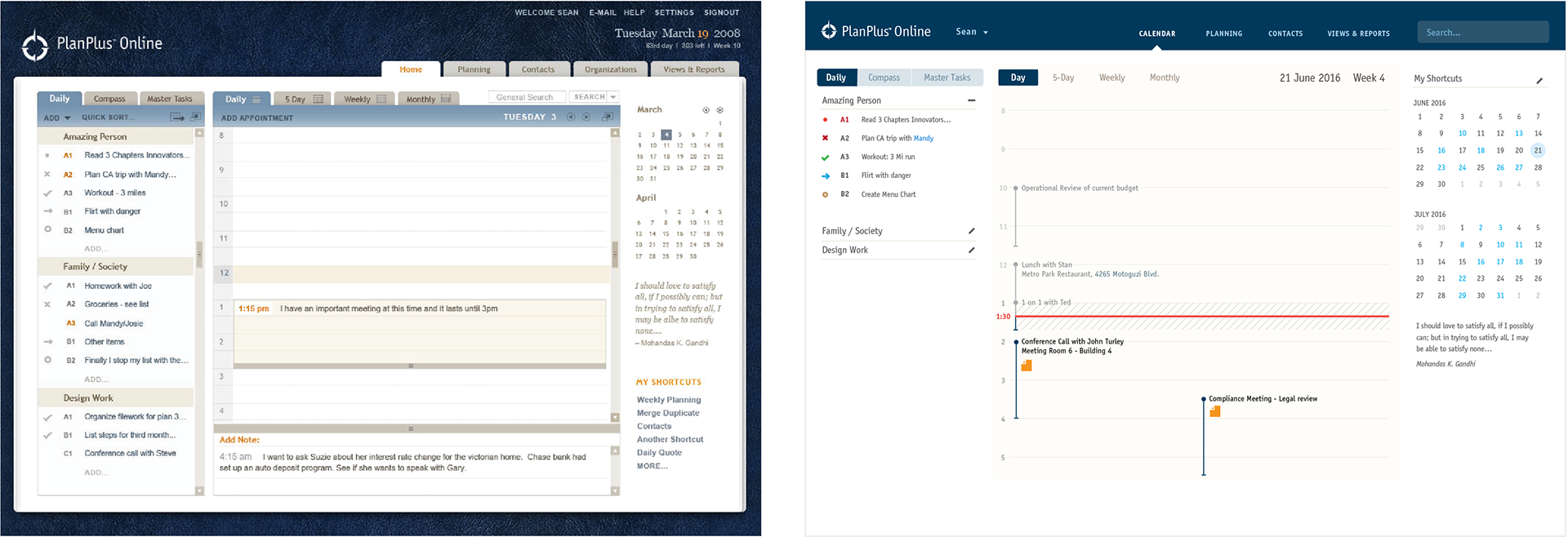
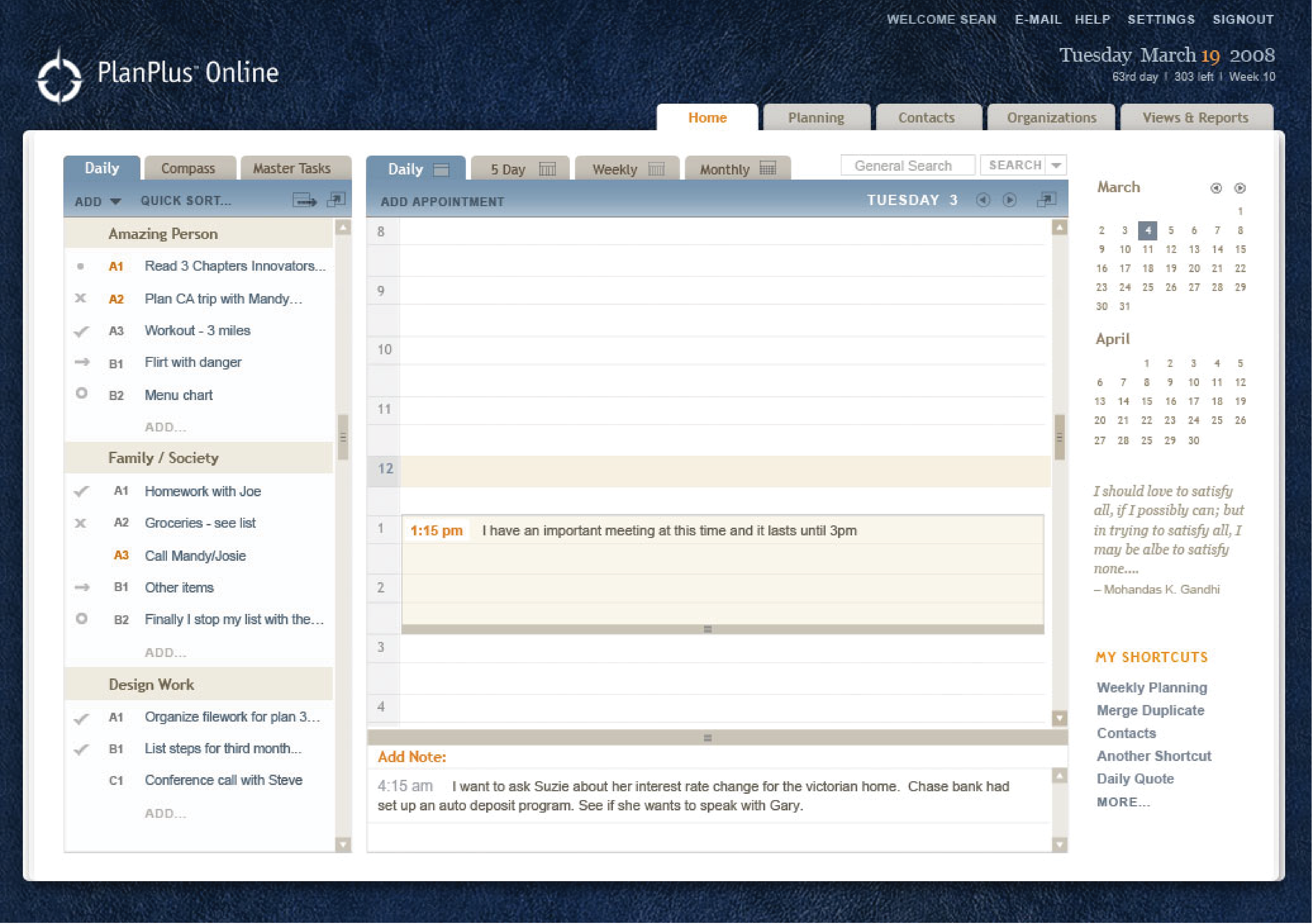
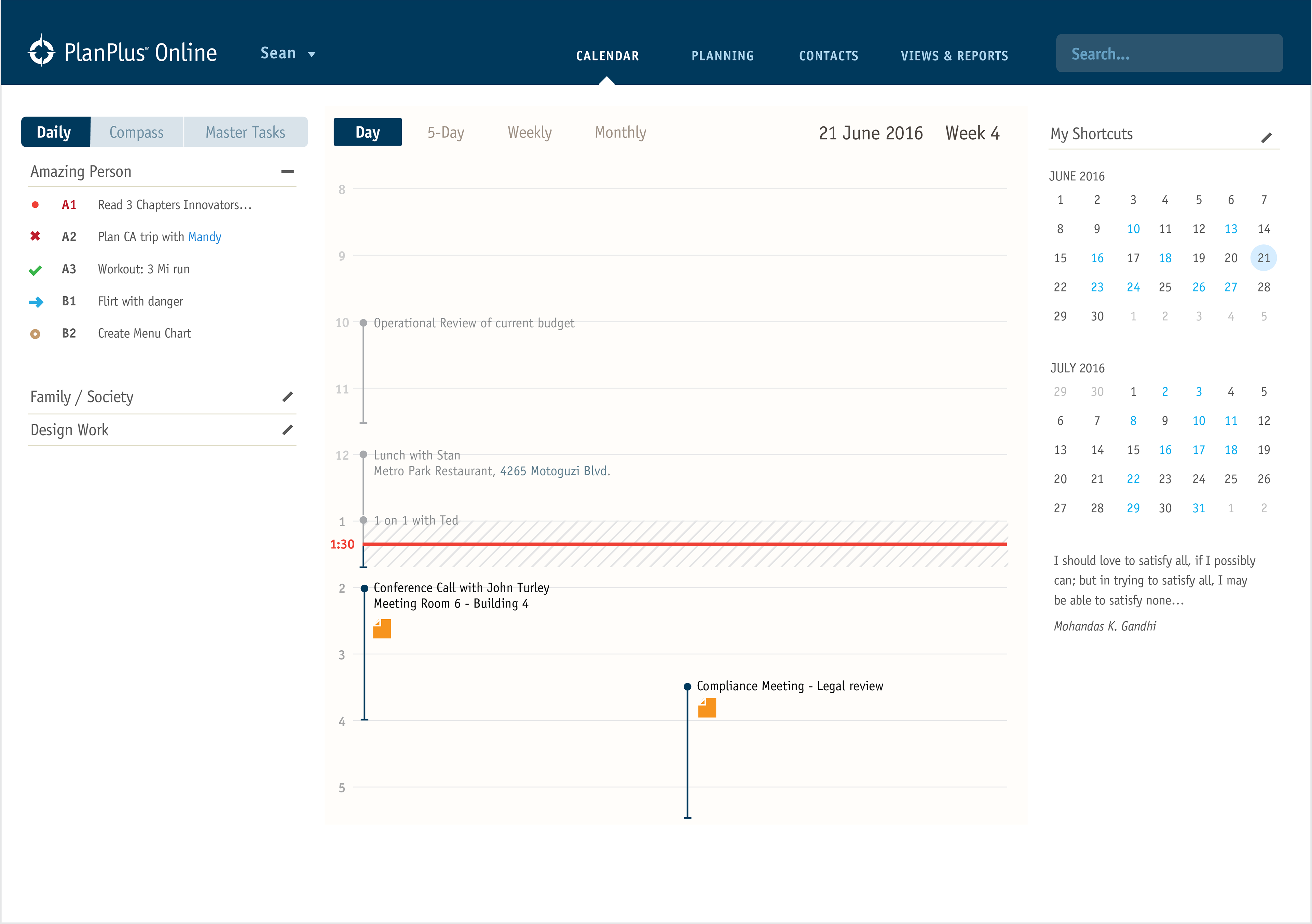
With the beginning of the visual updates, it only scratches the surface. There are other really exciting changes that could be made, making this a very modern, useful tool for their particular customers:
1 Make design responsive overall
2 Utilize swipe patterns and input methods, touch accesibility
3 Simplify visual elements to reduce clutter
4 Reduce header size to maximize interaction area
5 Utilize web fonts to more closely mimic branding elements and guidelines
6 Combine “organizations” as a piece or an element of the “contacts” section
7 Input and edit directly where user taps
8 Collapsable section elements (such as on task lists)
There is also exciting possibilities, such as outlook integration or gmail / google calendar plugins.